WRITER`S HOUSE
_
Alterations & Additions to an existing residence from the 1960’s
Completed: 2016
Location: Caulfield, Victoria, Australia
Photography: Peter Clarke
"The brief for Branch Studio Architects, was to bring the house into the 21st century, while honouring its rich history and the people who made their lives there".
"It was our joint intention that whatever new works we did to the house would not impact on the integrity of the original house and it memories. There is often a very fine line between creating a nostalgic 'museum' of something that was and removing all notion of the existing all together”
In 1960s Australia, the suburbs were a dream factory. A place where you could stake a claim for your family and put down roots for future generations.
For Adam and Rachela (Helen) Ser, Jewish refugees, who arrived in Australia via Belgium and Paris from the ashes of Hitler’s Europe in 1953, it represented something much more.
A war hero, who fought the Nazis with the Free Russian and Polish Underground Armies, Adam arrived in Australia with wife Helen – a survivor of the diabolical Nazi death machine, Auschwitz – with little more than the clothes on their backs.
They lived first in Elwood with family, before moving to a small house in Caulfield South with their only son Henri, while they grew their fashion business. When they could afford it, they bought a block across the street in the South Eastern Melbourne suburb and commissioned their dream home, the house they would live in for the rest of their lives.
Having grown up in middle class European families before the Holocaust scorched Europe, Adam and Helen were used to the finer things and wanted their new home to reflect this.
Built in 1968 by prominent architectural designer Michael R. E. Feldhagen (a protégé of renowned modernist master Ernest Fooks), the house represented the height of sophistication and state-of-the-art technology. Fooks and Feldhagen were Jewish European émigrés themselves and built many houses for wealthy Jewish families in the area. Combining European-inspired International Modernism with luxurious adornments and ornamentation they created a vernacular unique to Caulfield and the surrounding areas.
With bespoke joinery by master craftsman Jacob Rudowsky throughout, The house was a statement in design, but for Adam and Helen it was also more a proud symbol of triumph over adversity.
In 2013 after a horror year in which Helen, widowed in 1992, and her only son Henri passed away within weeks of each other, the house was handed down to grandchild Danielle, a digital marketing professional and her husband Adam, a writer, who set about restoring the house to its former glory.
Devotees of the dwindling flat-roofed, rectilinear gems that dotted the suburb, the clients were adamant that the home should be respectfully restored and preserved.
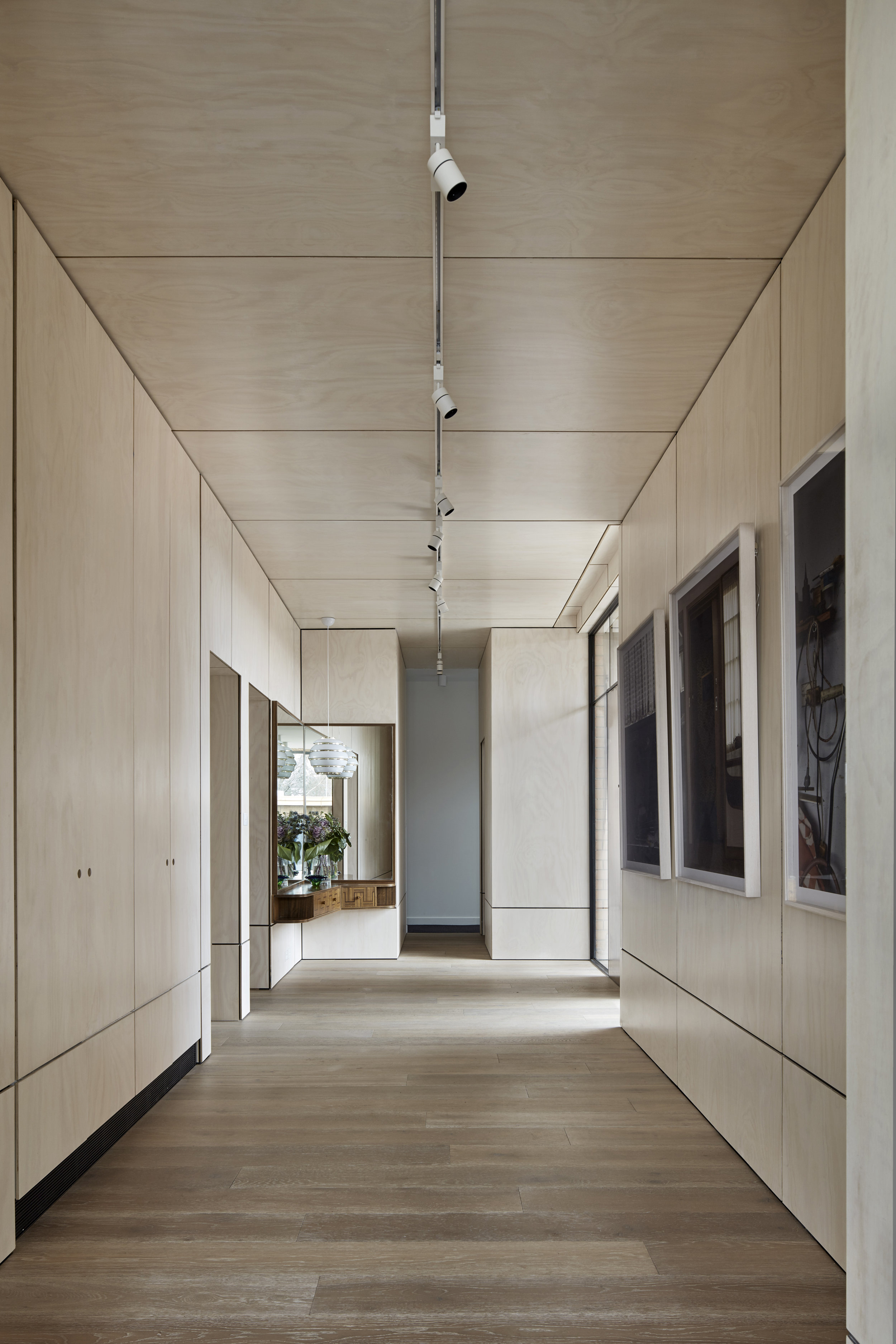
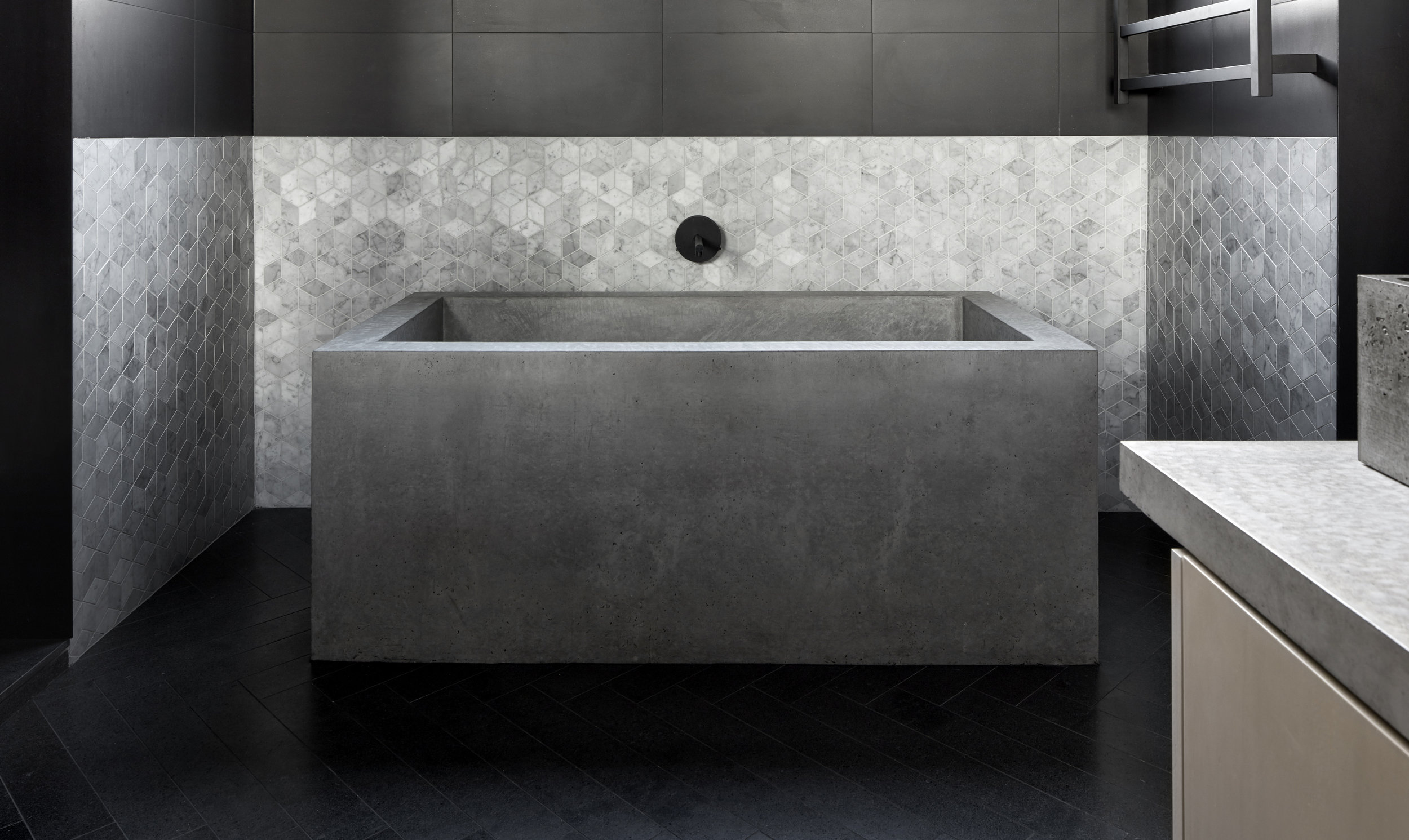
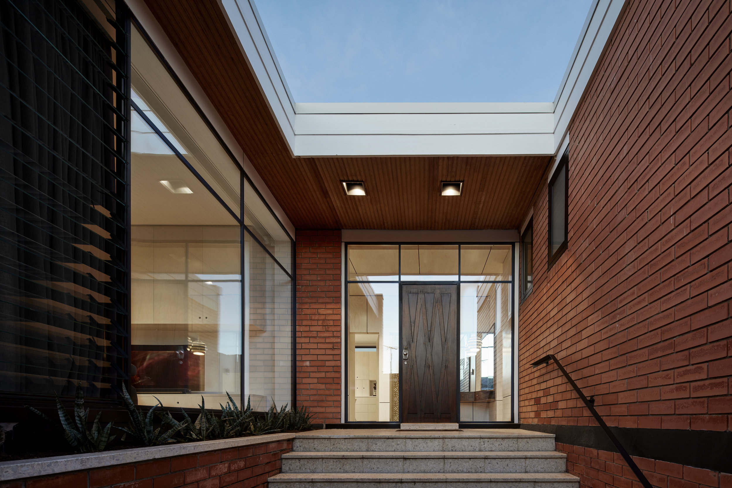
The brief for architect Brad Wray, of Branch Studio Architects, was to bring the house into the 21st century, while honouring its rich history and the people who made their lives there. It was about staying true to Feldhagen’s vision, while incorporating finishes and technologies that would have been alien on a residential build in the 1960s. Low profile, double glazed steel windows that take your eye, uninterrupted, out to the garden sanctuary; brutal, but beautiful polished concrete floors; sumptuous and tactile whitewashed plywood walls; a cantilevered kitchen dining island that announces the heart of the house; a utilitarian off-form concrete bath to luxuriate in.
Special care was taken to reincorporate the intricate, elaborate joinery. Combining these masterfully crafted cabinets with materials like plywood, plaster and concrete was always a risk. The hope was that the marriage of raw and refined would be seamless and elegant. The result far outstripped the expectations of client and architect.
It was important that this was a thoroughly modern, practical and beautiful family home that incorporated flourishes from the past, but it was to be no mid-century mausoleum.
To this end, every room in the double story building was totally reimagined, but each space retained hints of the original, Easter eggs pointing to what came before.
Nearly 50 years after the Ser family home was conceived, a new chapter begins, testament to the legacy of Adam and Helen, whose bricks and mortar statement of defiance and endurance was borne out of the darkest period in recent human history.
Adam Kamien – Writer & Client.
Architects Statement:
Located 10km south-east of Melbourne, Caulfield South is a suburb home to a diverse range of architectural styles from Edwardian weather-board to Californian Bungalow to Red & Orange clinker brick.
Alarmingly - It is visually evident to see an increasing trend of these original housing styles being demolished to make way for large, two storey modern housing typologies. These are often conceived as mock - Neo-Georgian or rendered triple-fronted brick veneer.
Around the 1960`s and 70`s a number of European trained architects such as Ernest Fooks began designing a series of superb International Modern style inspired houses in and around the Caulfield and wider area. A protégé of Fook`s – Michael Richard Ernest Feldhagen also completed a number of exemplar International Modernist Style singular residences and mutli-residential flats around the same period.
Writer`s House is an alteration and additional to an existing orange brick veneer residence that was originally designed in the late 1960`s by Michael R E Feldhagen. The house was originally built for the current occupants Grandparents who were Jewish holocaust survivors and immigrated to Australia a few years prior to building the house.
The house was filled with beautiful original custom joinery specifically built for the house by Jakob Rudowski - A local joiner who made quite allot of furniture around the area in the 1960`s and 70`s.
In 2013 - the grandparents passed away and due to the distress of this event for my clients - The house lay dormant for a good part of 2 and a half years.
The first day we met with our clients was one of the few times they had come back to the house after losing their grandparents. This was obviously an emotional but somewhat therapeutic event - knowing that they were going to extend and celebrate the life of the Grandparents house through some extensive renovations.
I may note: Cigarette butts were still balancing on the side of ashtrays around the house from years prior. Surprisingly - The house did not have an eerie feeling given these types of frozen moments scattered around the house.
My clients – Danielle who works in DIGITAL MARKETING and Adam who is a screen writer/journalist were heavily involved during the design & construction process. Adam`s background in writing, created a key driver in the way we approached the individual spaces within the house as chapters that were curated as a part of a whole story.
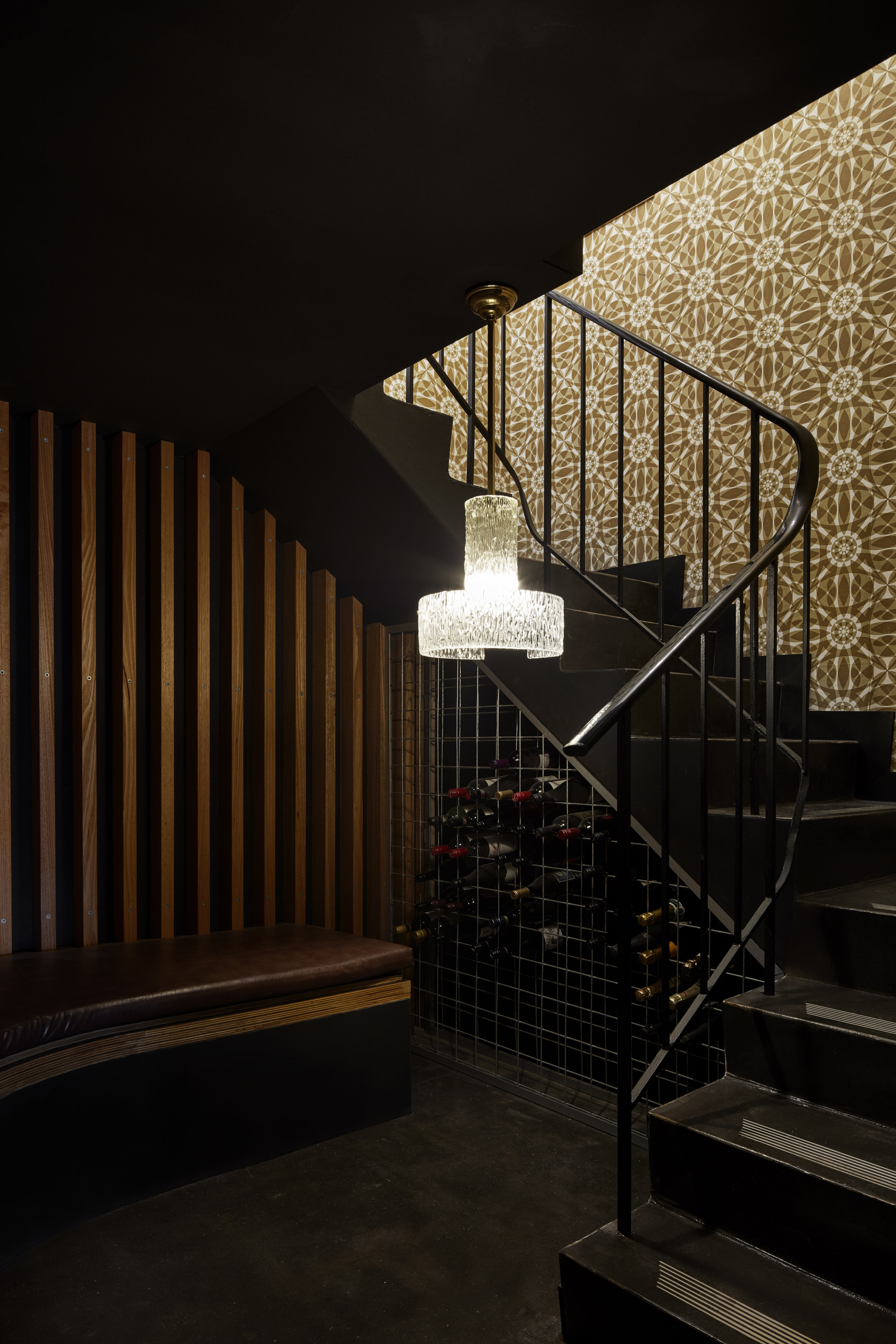
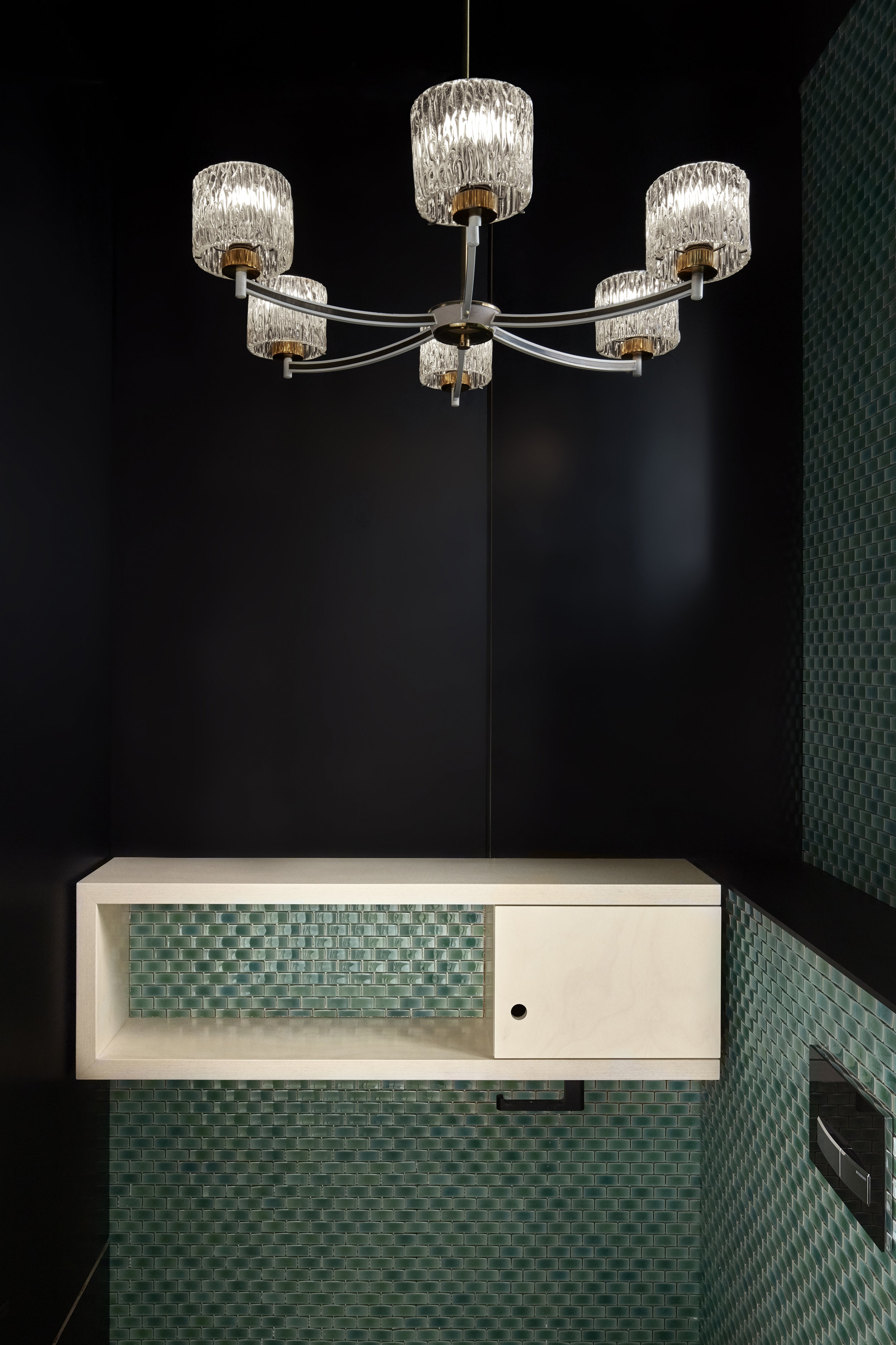
It was our joint intention that whatever new works we did to the house would not impact on the integrity of the original house and it memories. There is often a very fine line between creating a nostalgic 'museum' of something that was AND removing all notion of the existing all together. Existing Wallpapers, Chandeliers and Building Fabric were kept where possible including the existing Rudowski Furniture which was restored. A number of existing sofas have been reupholstered to give them a new life.
This existing fabric has been very carefully set in contrast with new contemporary furniture, joinery and materials, that reside as a background palette to highlight the existing and at the same time - celebrating the new.
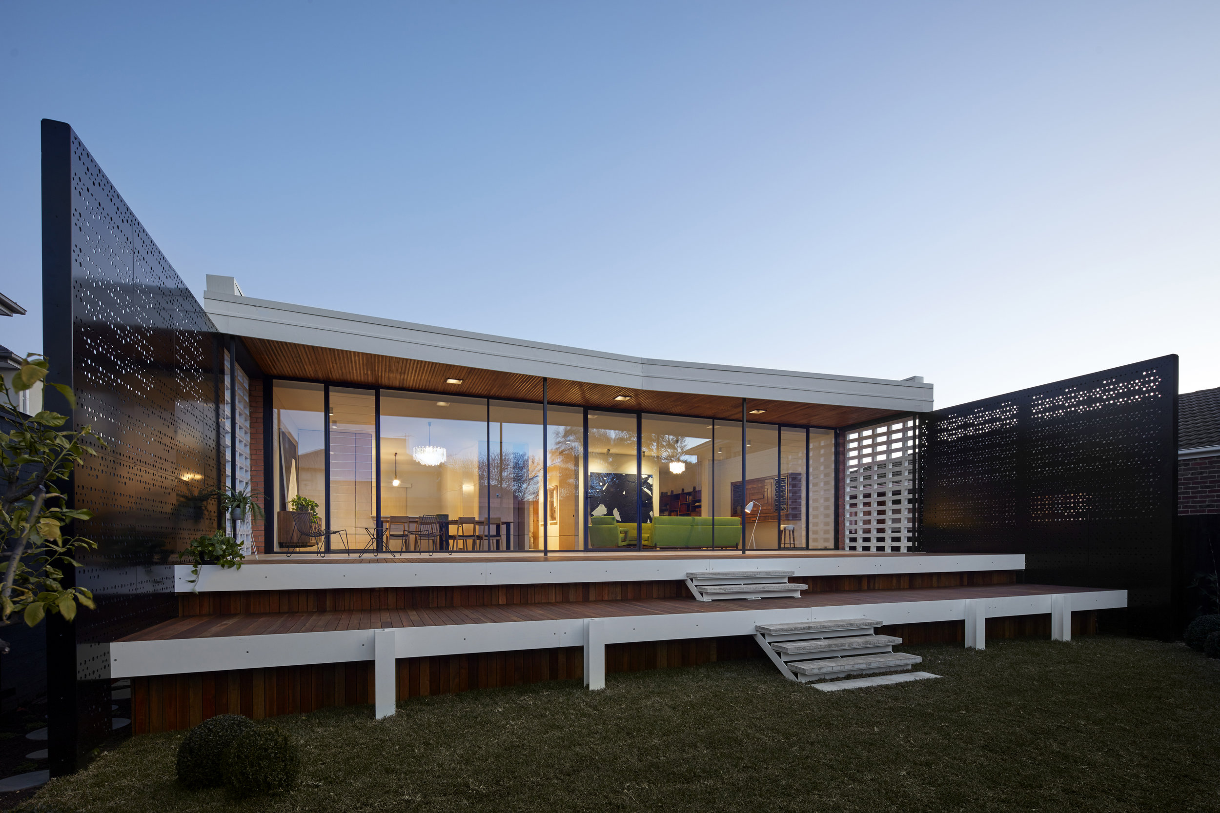
Both existing rear and front painted timber windows were replaced with full height steel windows that encompass the interior spaces with a rich warm light.
The project consisted of an extensive internal renovation and some external works.
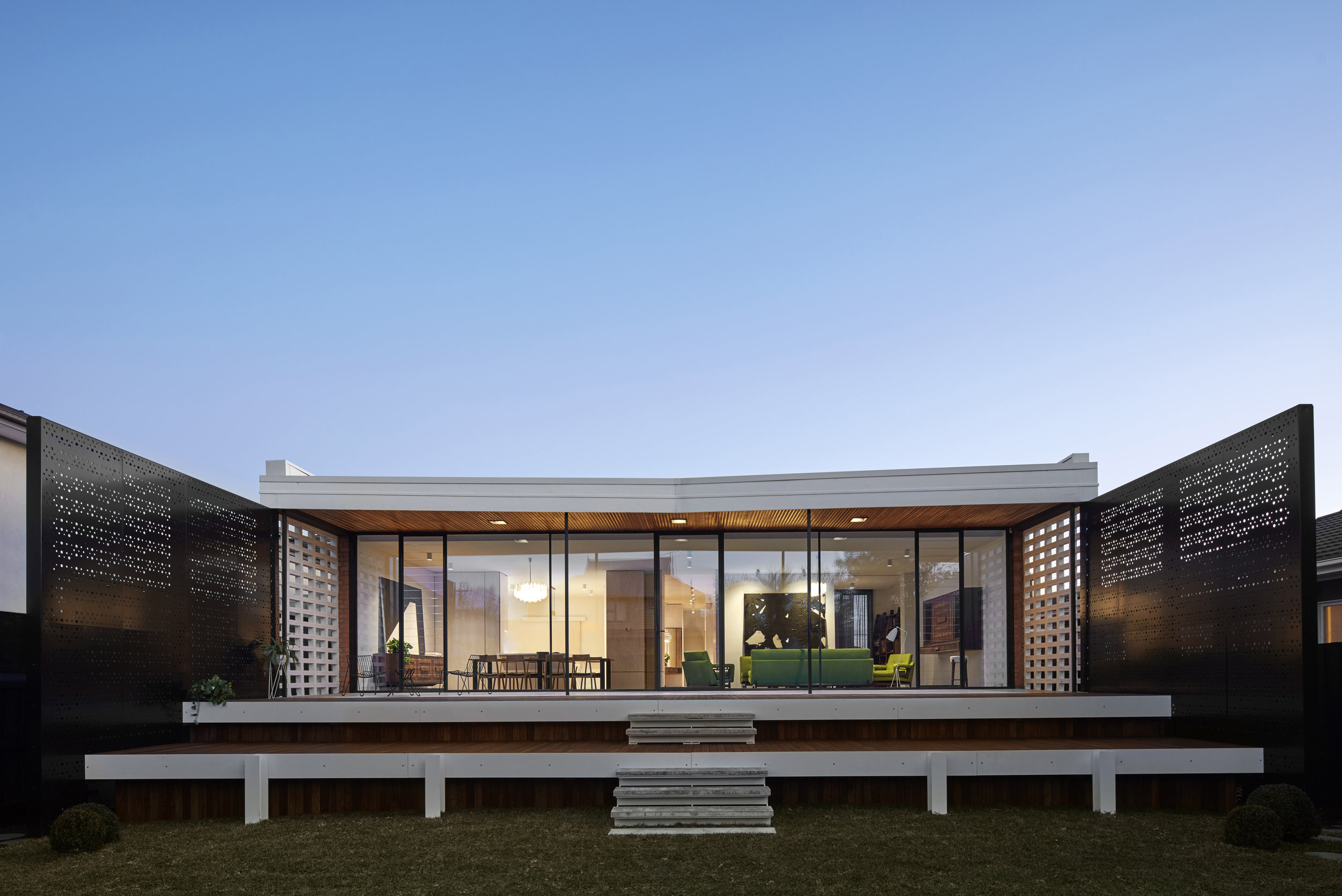
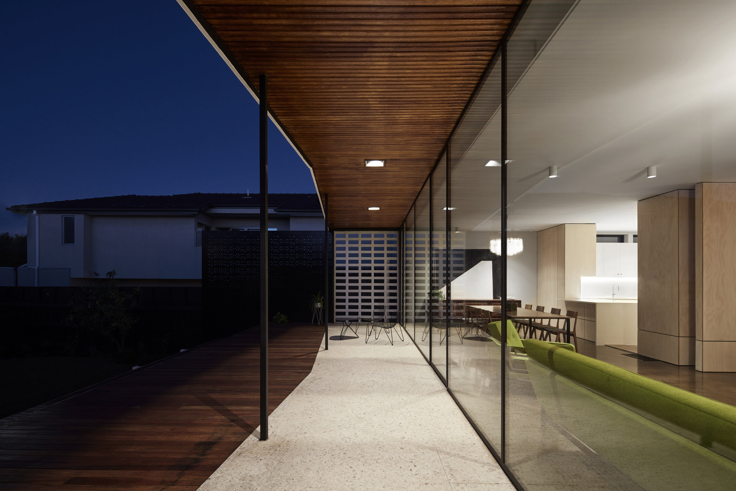
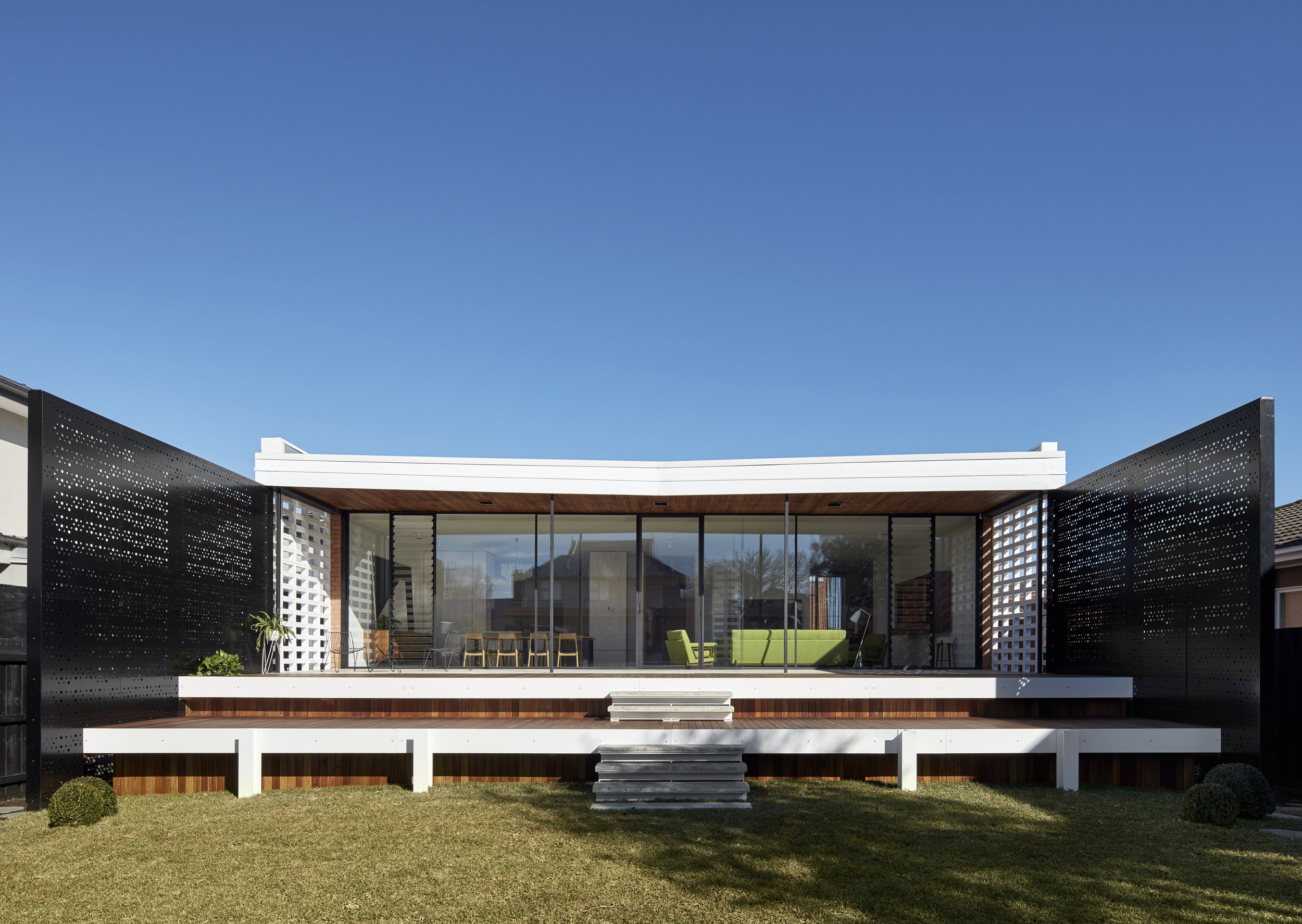
A new large ‘party’ deck bounded either side by two black aluminium perforated privacy screens not only solved a practical issue of overlooking but more importantly was used to extend the internal areas to create a much more flexible internal/external cohesion of space.
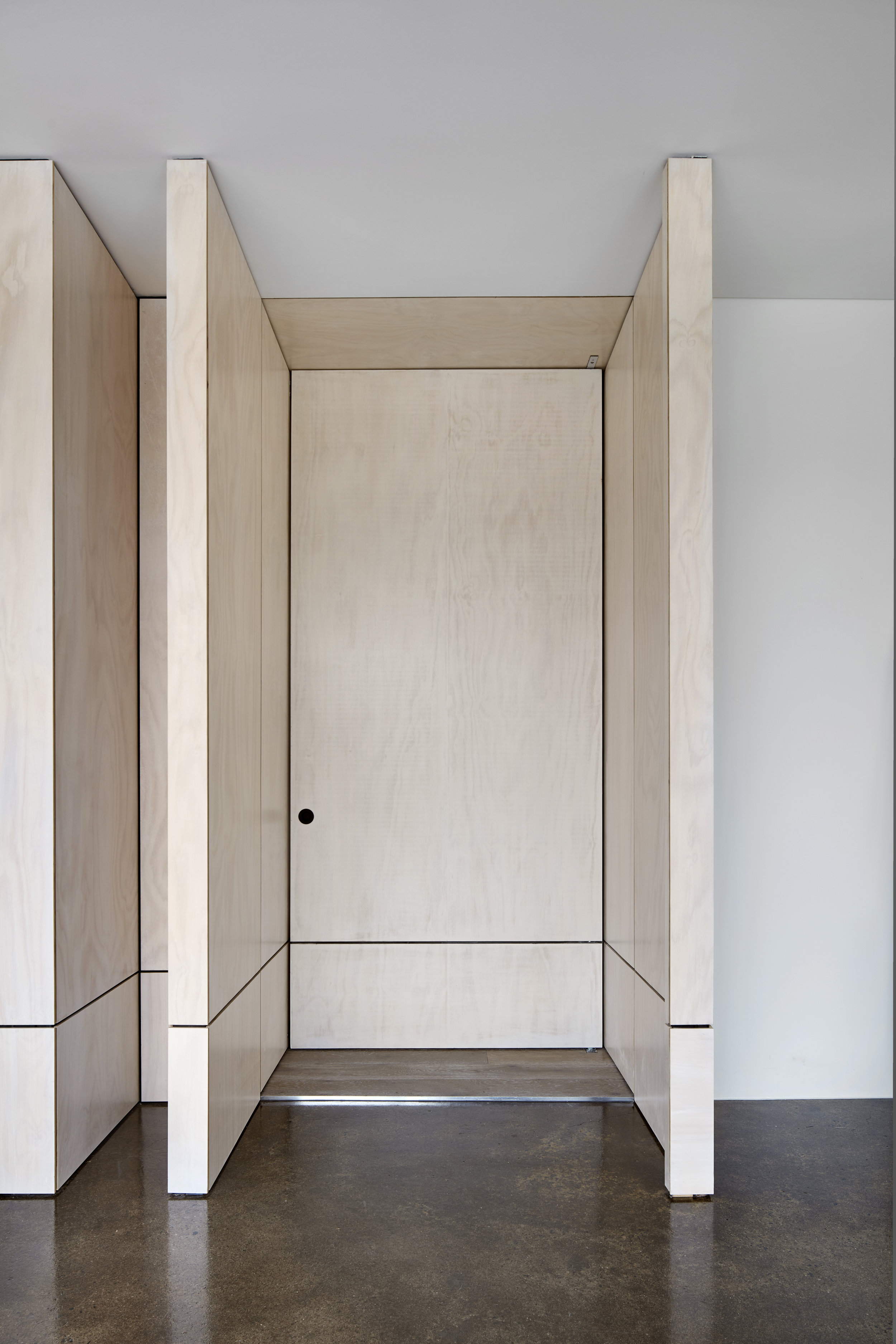
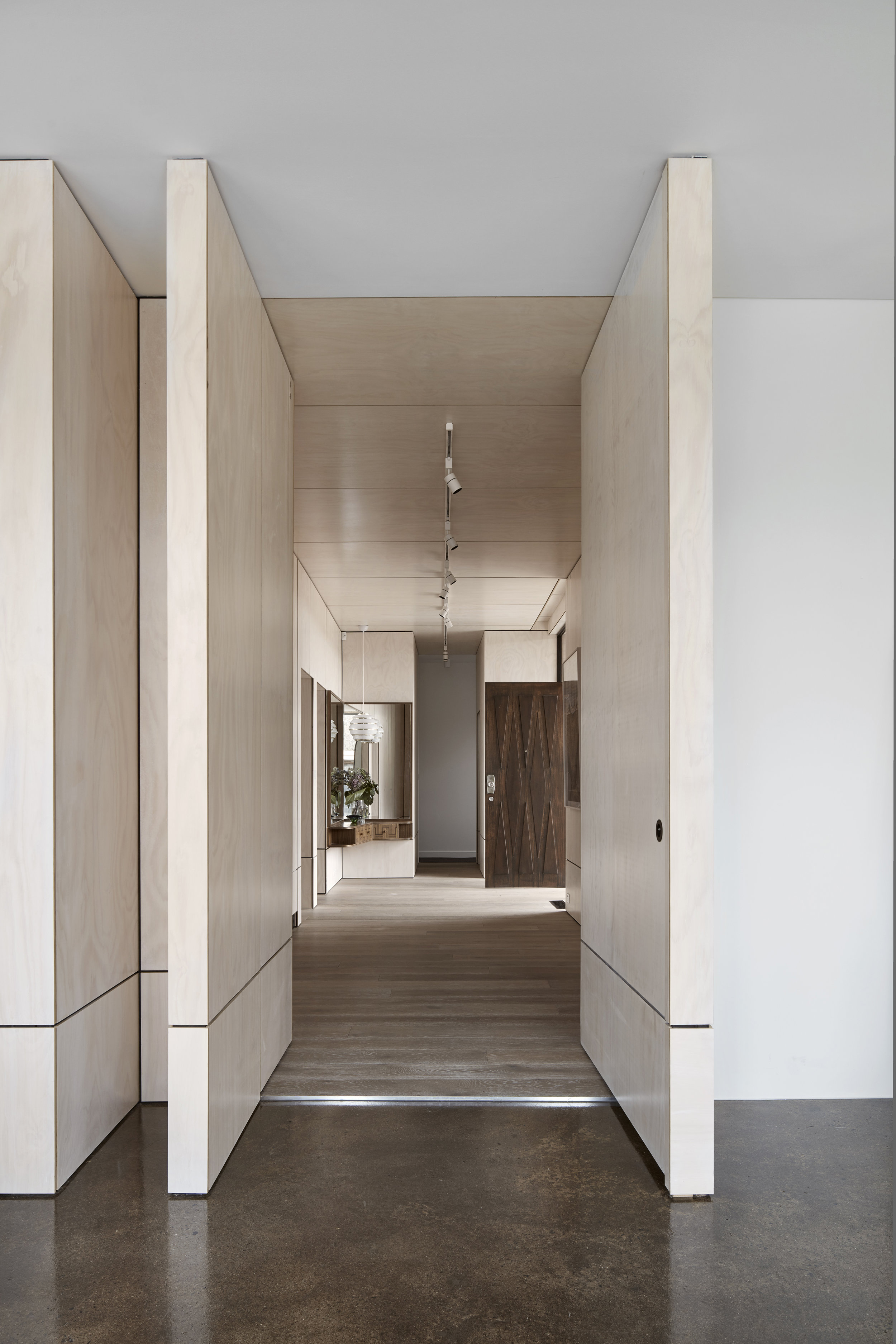
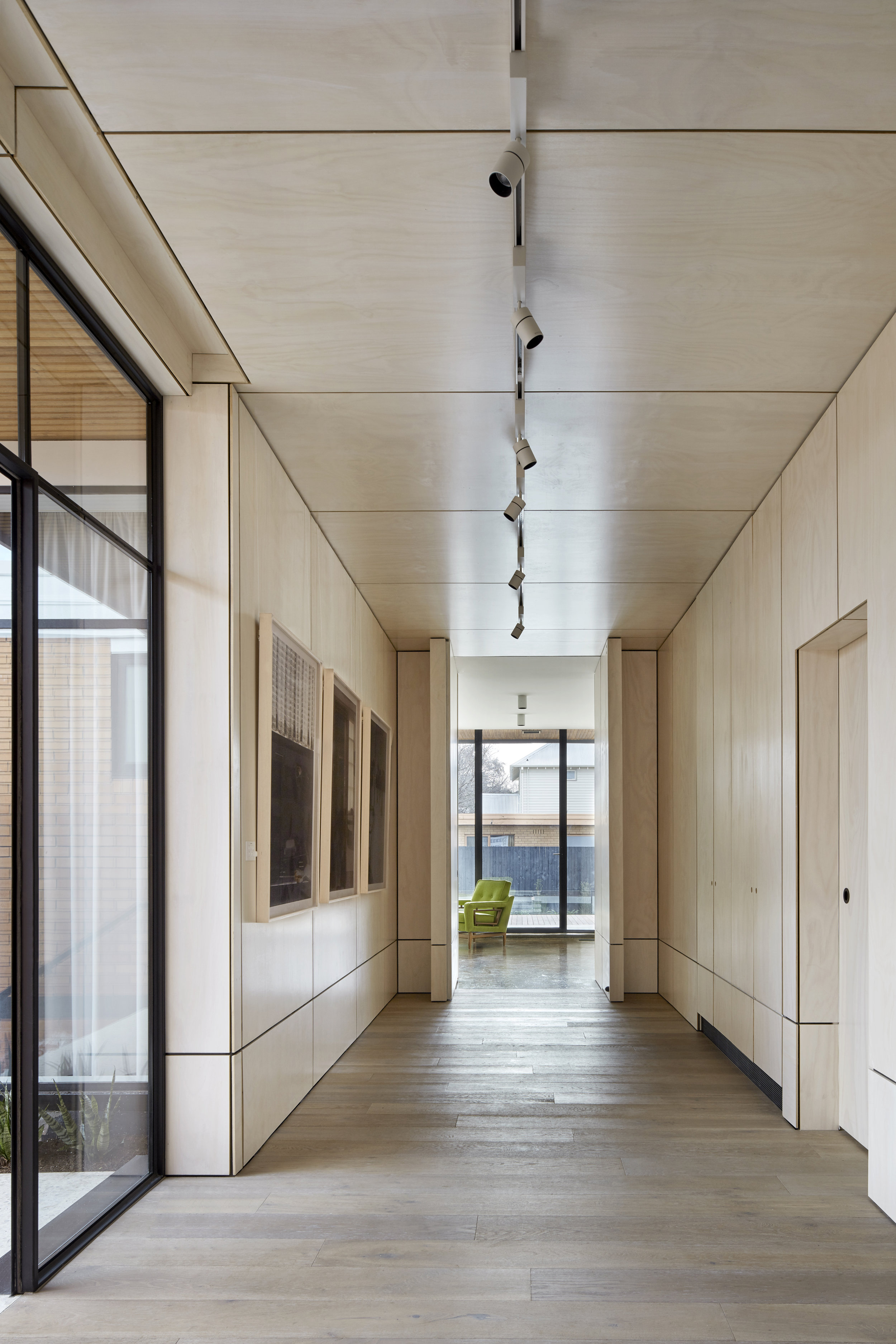
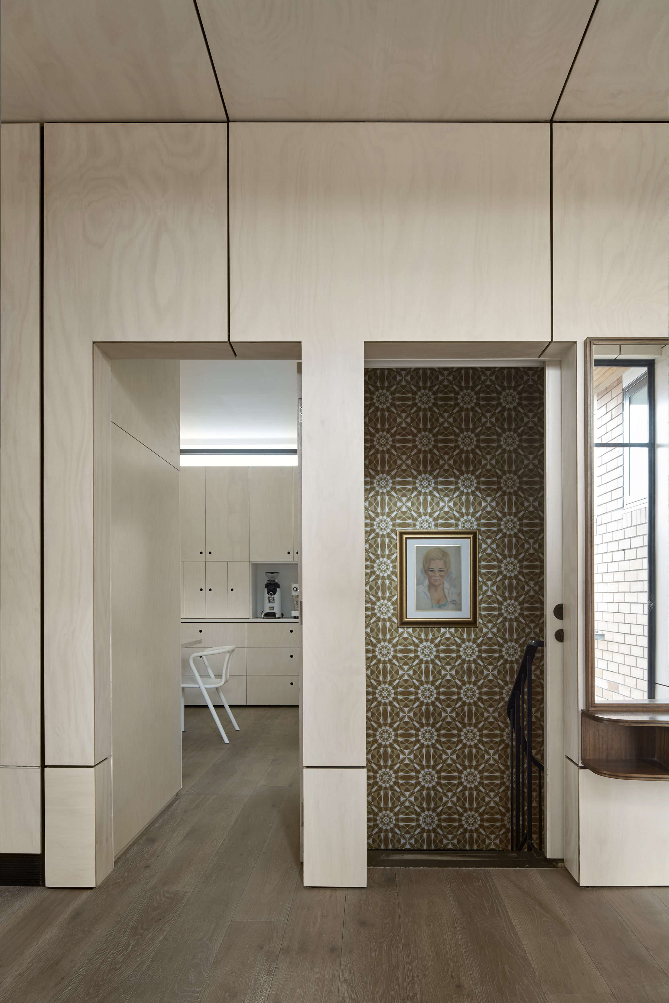
An existing dark corridor/foyer space has been re-imagined as a light filled, plywood lined gallery space to hang art and offer a surprise to the unsuspecting visitor. This space also acts as an umbilical of sorts, simultaneously linking & closing off the living, kitchen and dining spaces of the house with the more private bedroom areas when the occupants are entertaining.
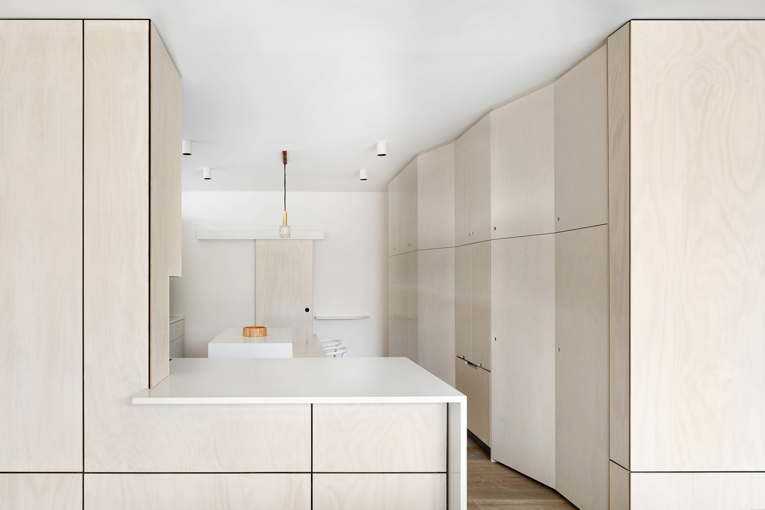
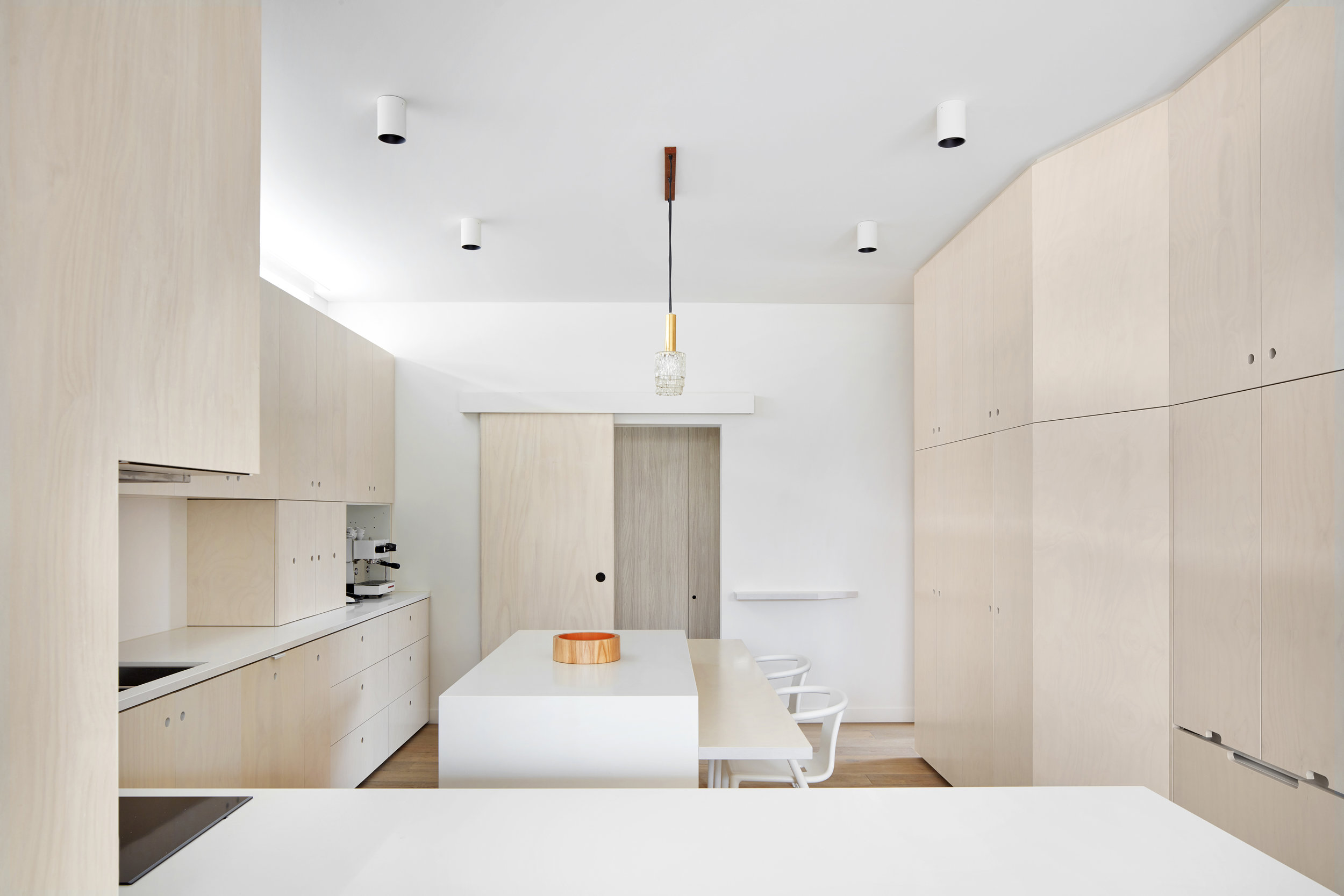
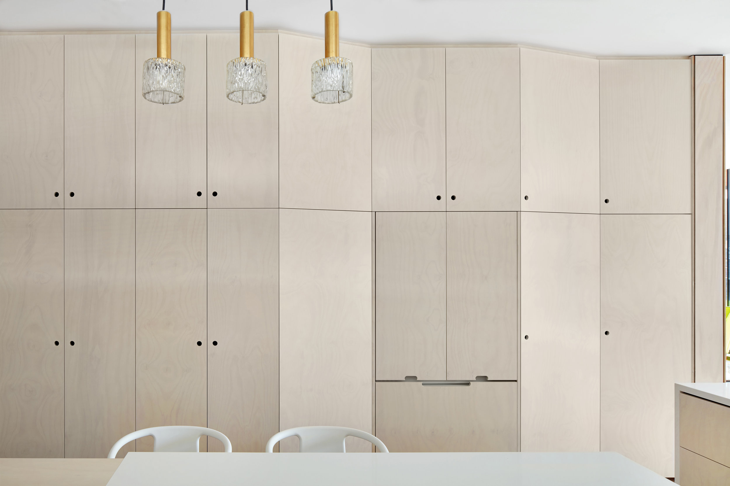
A section of wall was removed from the existing kitchen to submerge the dining area & yard back into the house. The kitchen itself represents a minimal yet utilitarian palette of materials & details. Set in a minimal white plaster & limewashed ply finish the configuration of cabinetry allows the kitchen`s mess to be hidden away through a series of bi-folding & sliding panels.
Compositionally opposite to the kitchen, A cozy TV ‘snug’ space is tucked back into the house to create a more intimate area specifically for watching movies & the reading of a good book. A large full-height sliding panel allows the space to become ‘a part’ of the main living area or made completely separate & hidden beyond.
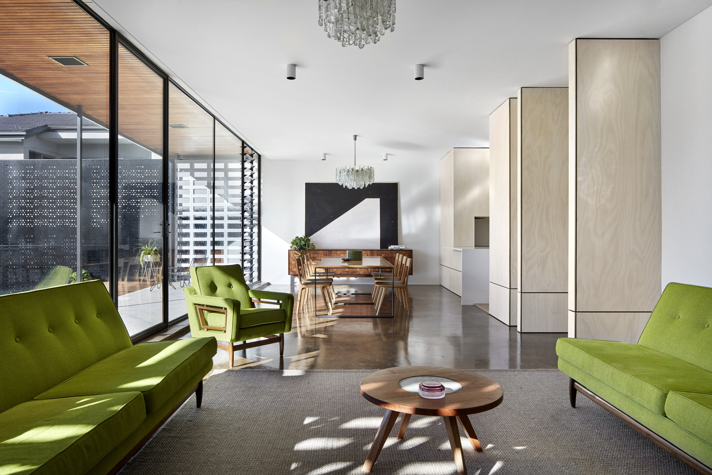
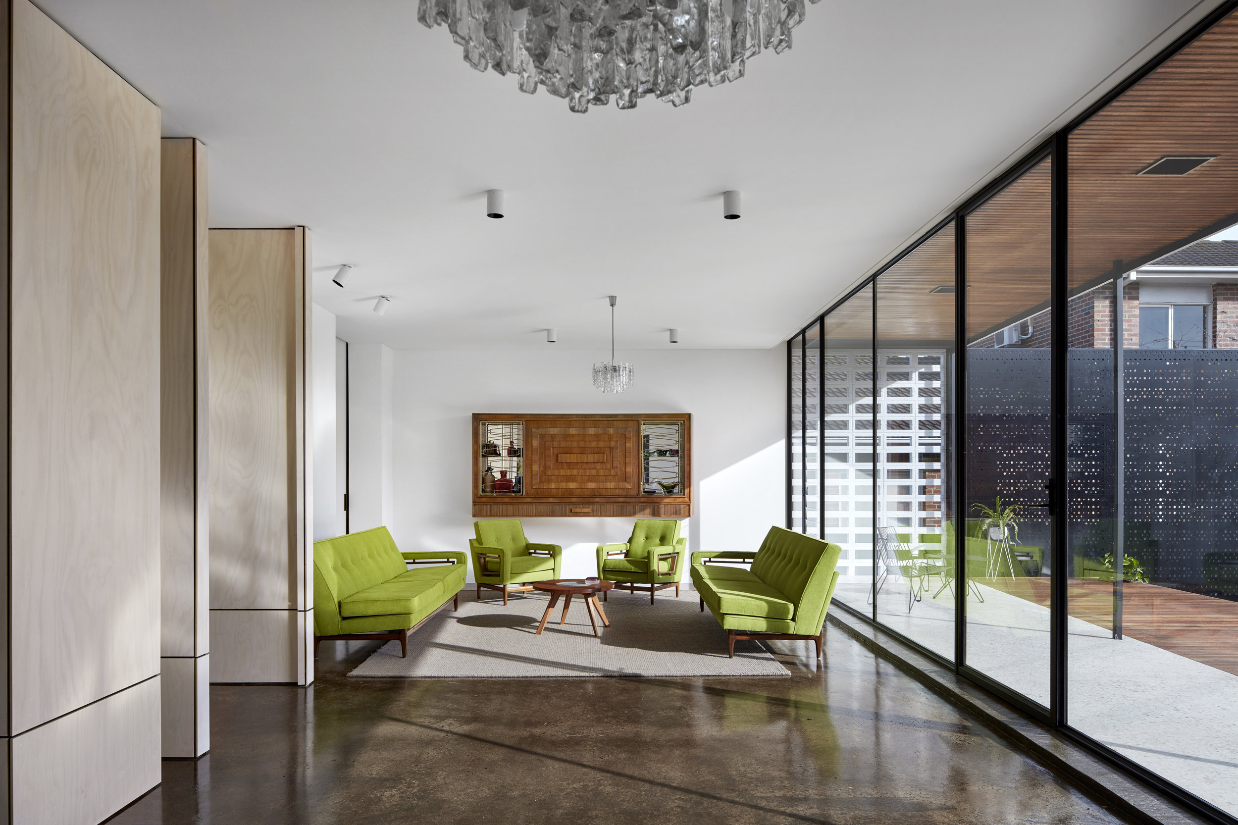
Both Kitchen and TV Snug open out to a generous living and dining area, free of a TV and instead highlighting restored memories of the past. At one end, a linear rosewood sideboard and the opposing, a wonderfully crafted pull-out bar unit, both designed and made by Jakob Rudowski in the 1960`s. The existing sofa`s [also Rudowski`s] have been bought back to life, re-imagined in a bright lime green upholstery. A new custom Oak and steel dining table seamlessly tie with the rich polished concrete slab throughout the space. The reflections projected internally through external open blockwork and perforated aluminium screens add a surreal play of light through the newly installed full-height steel windows throughout the day. Operable louvres in the TV snug and main living & dining areas create opportunity for cross-ventilation to occur and create flexible control of the internal temperature throughout the day.
At the other end of the house – A series of bedrooms and bathrooms were
re-configured & re-imagined to accommodate the client and their growing family.
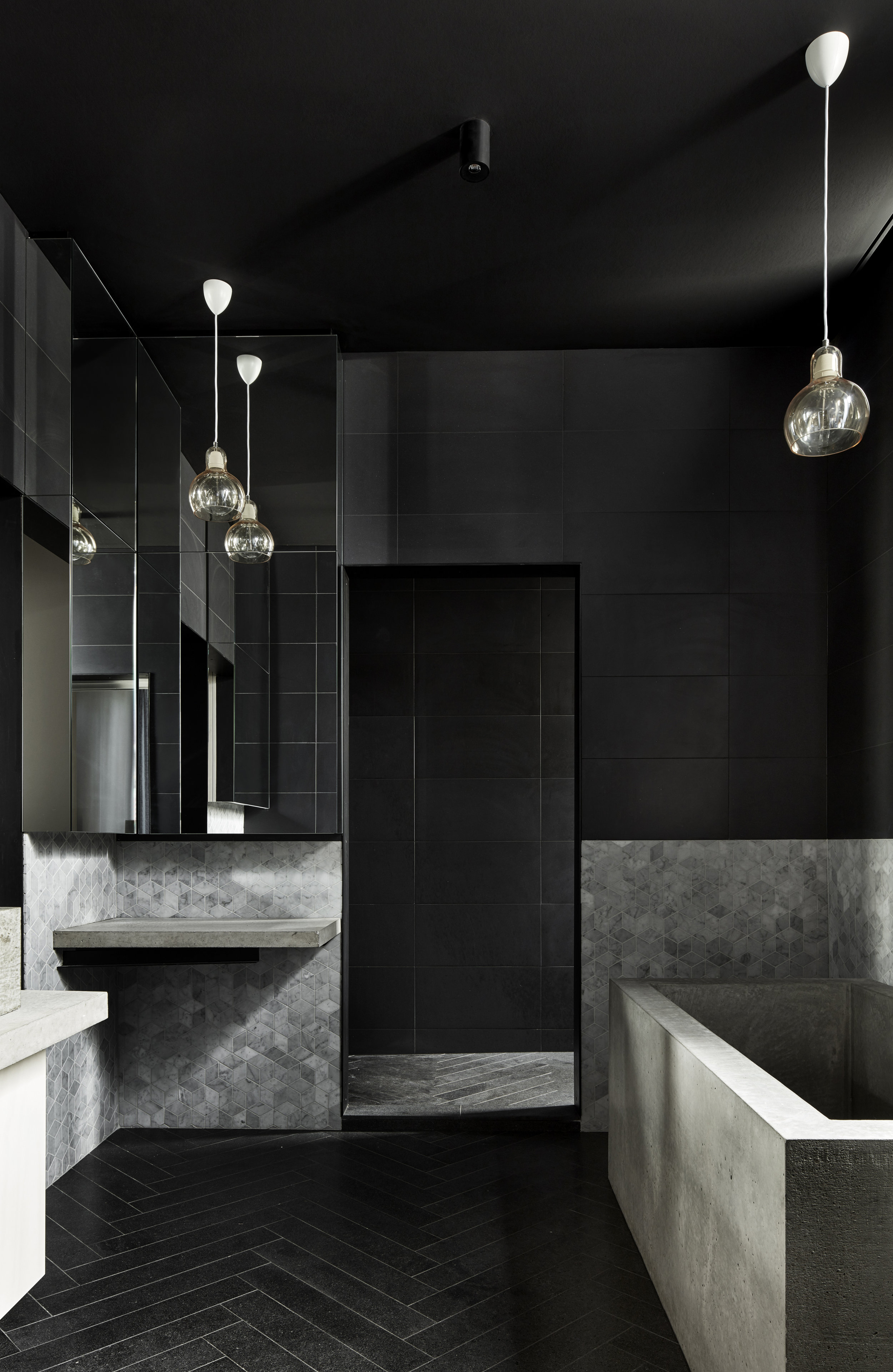
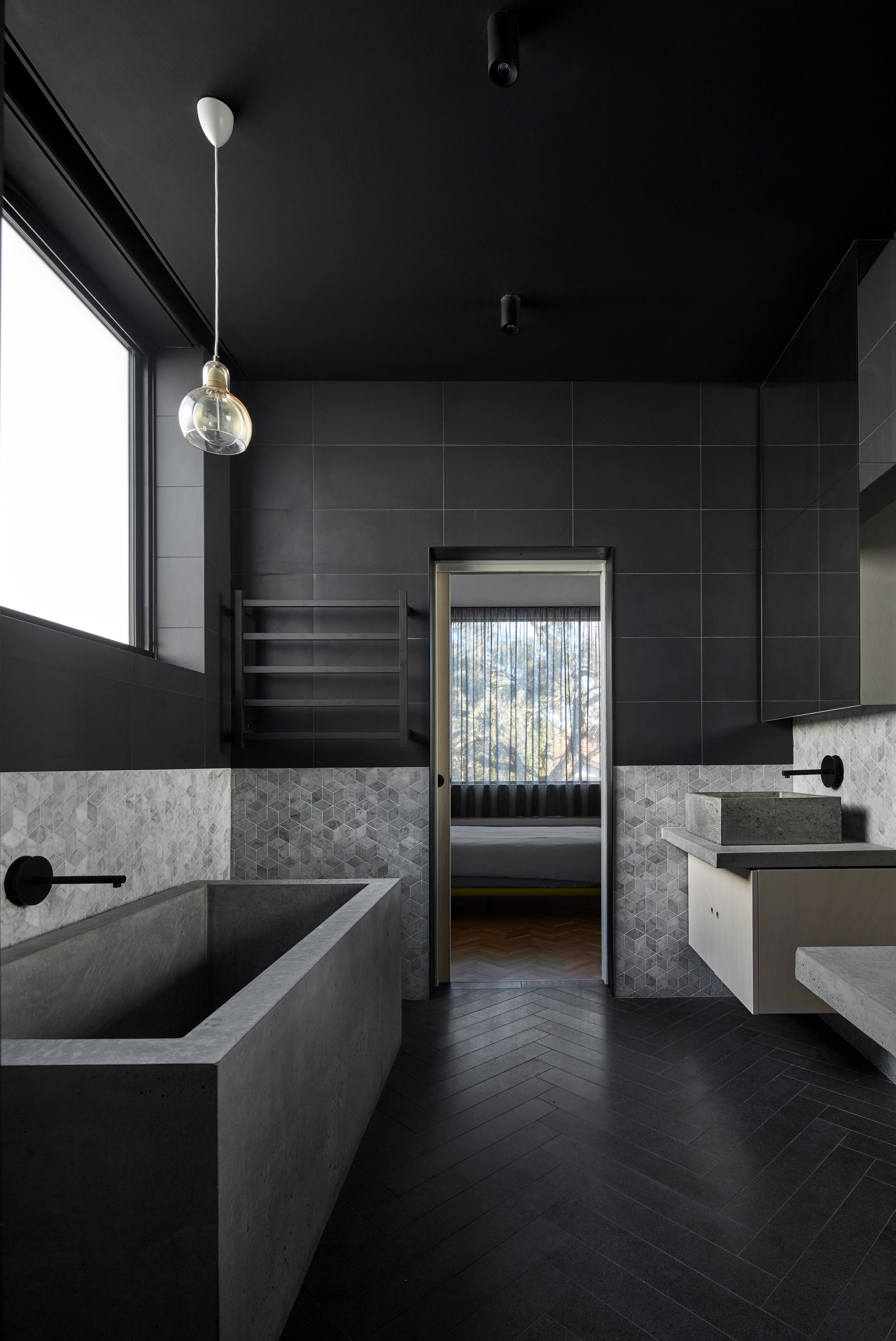
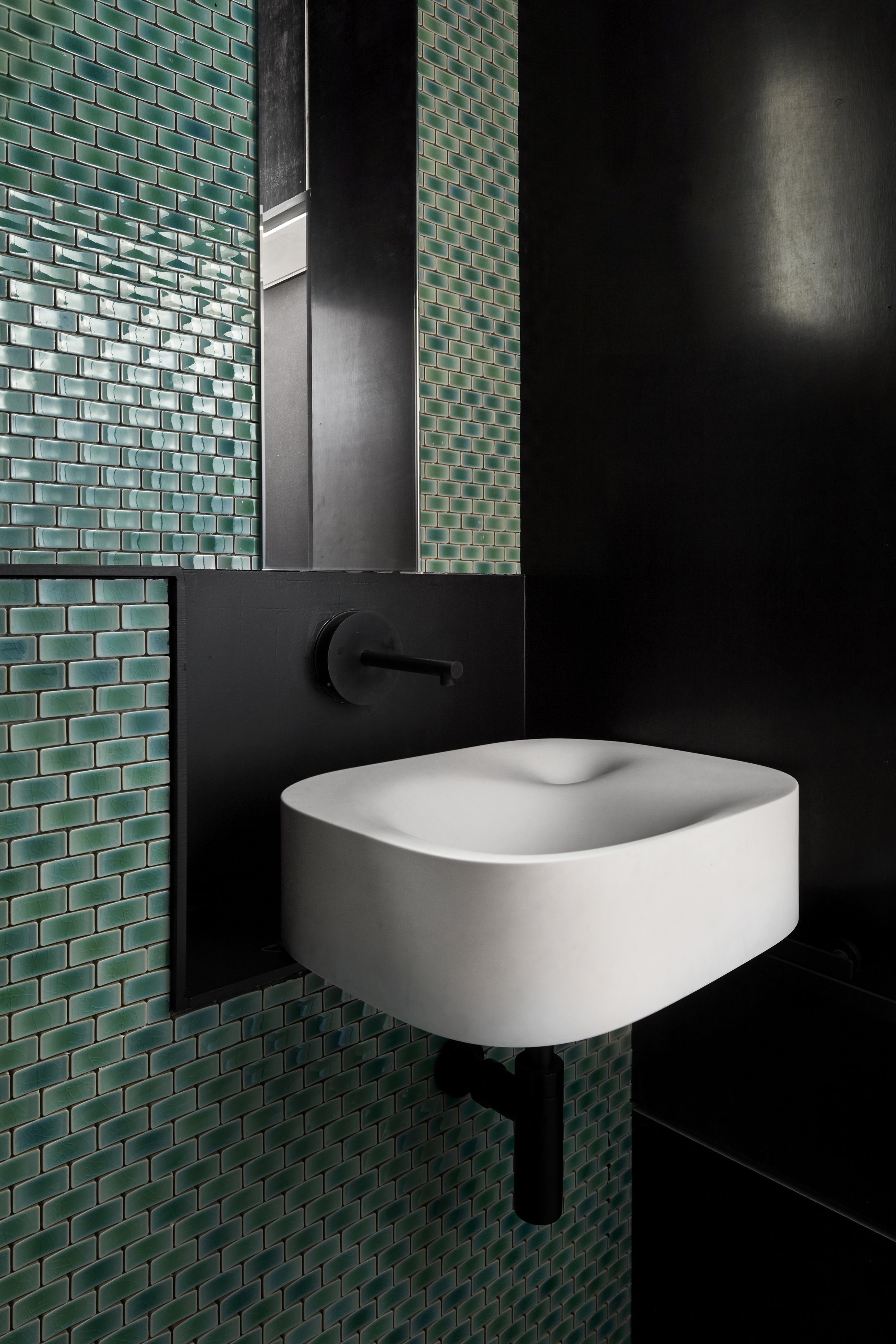
Linking to the foyer/gallery – a modest powder room clad in black formply and concaved delicate green tiles, creates a bold introduction to the spaces. A series of three bedrooms and a kids bathroom spawn off a central corridor, part of which was taken up to accommodate a walk-in-robe for the master bedroom. The master bedroom is light filled and has framed view of a tree canopy within the front yard. A robust yet sleek ensuite, featuring a series of poured insitu concrete elements such as a bath, basin and vanity tops contrast with sleek black steel thresholds, mirrors and pendant lights in conjunction with a filtered natural light to create a ‘moody’ spatial thematic.
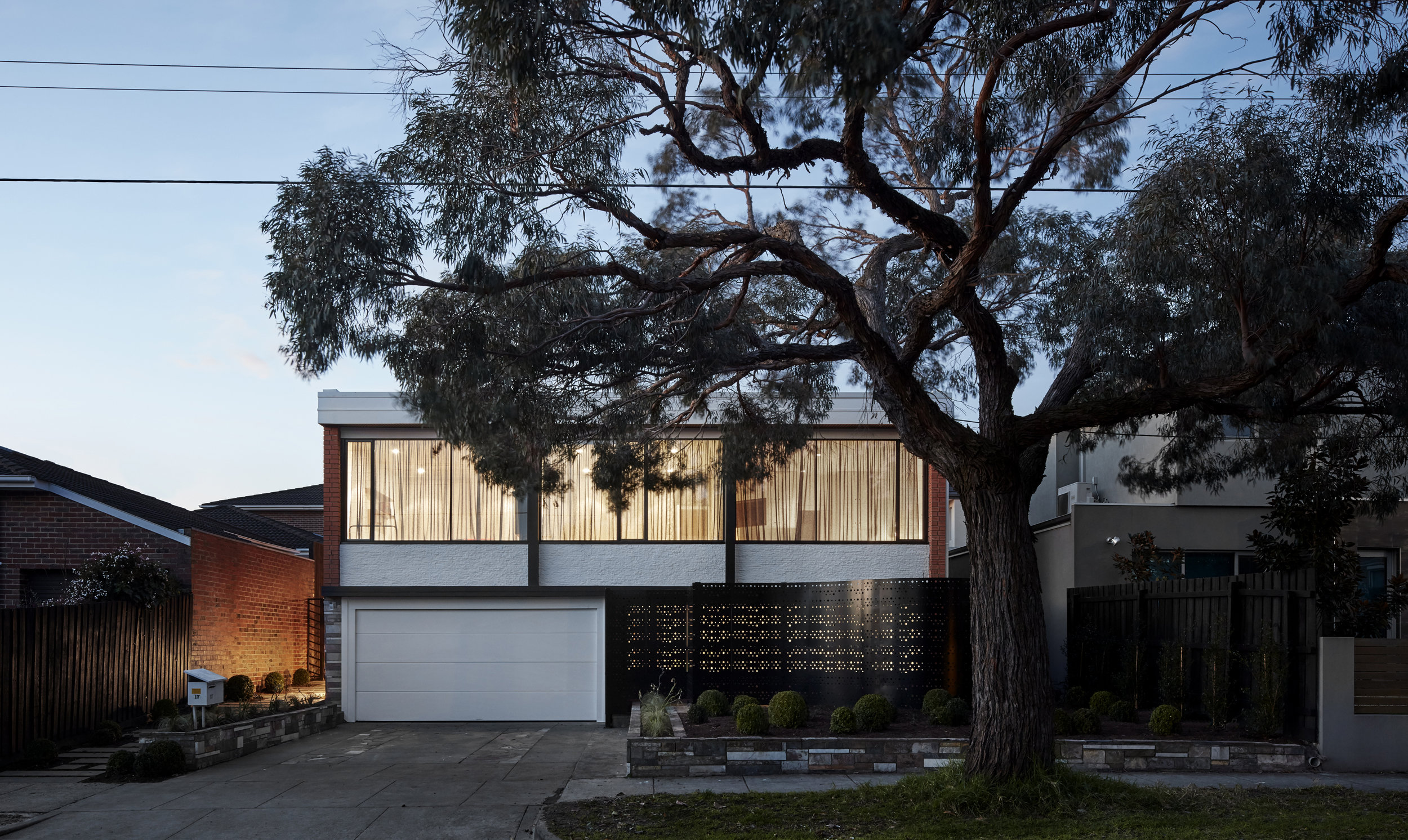
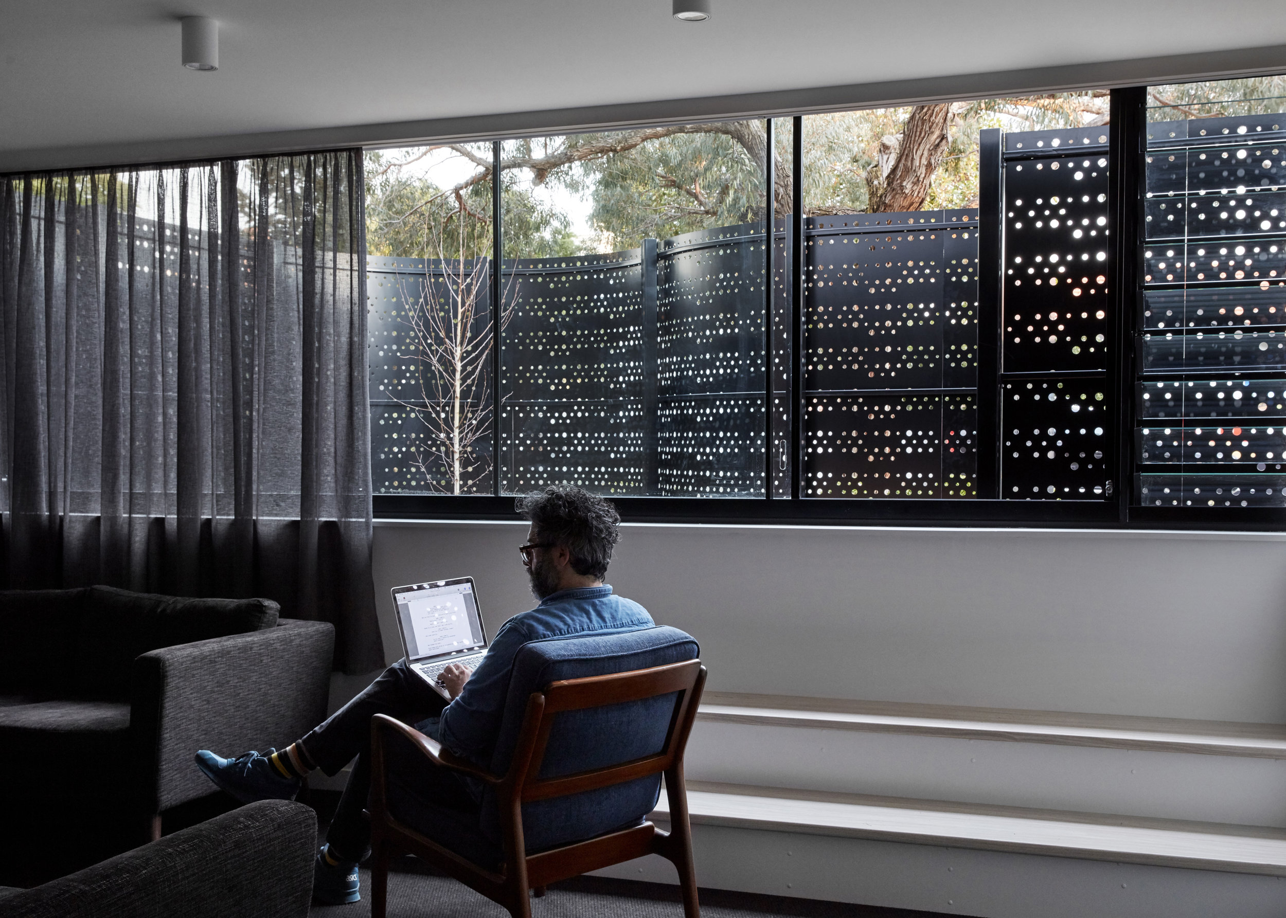
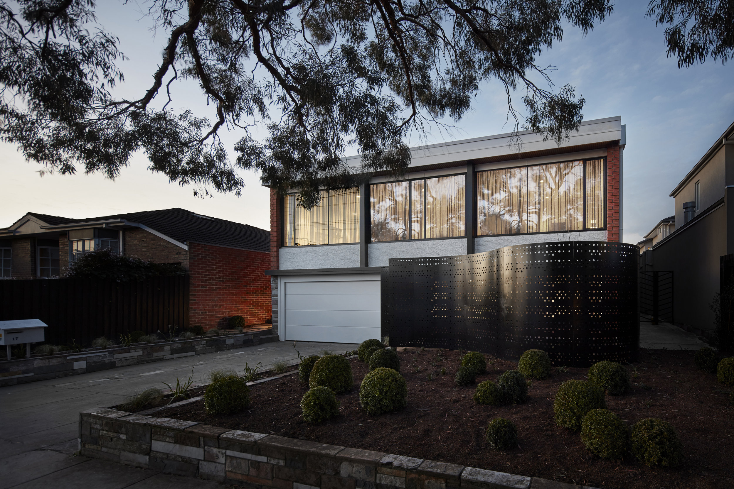
The lower [down-stairs] areas of the house have been re-configured to become a self contained unit of sorts when the client`s young children grow up. For now - the spaces will host, an intimate subterranean whiskey den/wine cellar for a late night nightcap, a bathroom and a writing room, which has a direct physical link to the front courtyard. This front courtyard space was re-claimed from the previously unused- front garden to become a practical and useable space for contemplation and relaxing. The addition of this sweeping screen to formalise this area was to be the sole formal adaption to the existing identity of the house from the street.
From street level, the existing front windows were replaced with thin steel, double-glazed windows. A minimal white colour scheme was applied to the existing stone and aluminium fascias. The colour black was used to celebrate existing formal structural lines. The existing orange bricks have been retained to maintain the house`s history and timeless glory.

